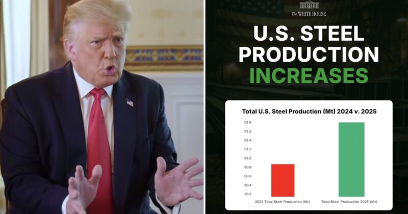
The White House shared this wildly misleading graphic and it’s proof they think Magas will believe anything (and they will)
8.
The vertical scale here is a felony-level graph crime. https://t.co/8oFDguNqyz
— (@chrisbriem) February 1, 2026
9.
Just last week my boss told me to change the scale on a chart to make the change look more dramatic and I told him “come on let’s be professionals here” https://t.co/bzlv9NhPr0
— Pochard Capital Management (@PochardCapital) February 1, 2026
10.
A 1% increase becomes Mount Everest. https://t.co/RGKwHjKrtw
— John Jackson (@hissgoescobra) February 1, 2026
11.
10/10 community notes
— Alex Cole (@acnewsitics) February 2, 2026
12.
Nice graph, it would be a shame if someone actually read the figures
— Aleksandar Djokic (Александар Джокич) (@polidemitolog) February 2, 2026
13.
Brought to you by the administration that dismantled the Department of Education. ♂️ https://t.co/1Lm0fQhQBl
— Matt Linn ⚡️ (@Mattlinn01) February 2, 2026
14.
I desperately need anyone still clinging on to MAGA to understand the admin you voted for is laughing at you https://t.co/UBDigdUsZ9
— kodo (@apemangodzilla) February 2, 2026
15.
1% increase…. that’s “Noise” in the data.
— Dickens Charles (@DickensToo) January 31, 2026
And just in case you wanted to see it in its correct proportions, there was this, courtesy of Rex__Luscus over on Reddit.
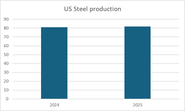
Source: Twitter @WhiteHouse