Simply 17 brand logos with hidden meanings you might now know about
You’ll know most of these brand logos – let’s face it, you’ll probably know all of these brand logos – but did you know each of them has a hidden meaning?
Well, probably some of them, yes, you did know that. But hopefully not all of them. Anyway, here they are.
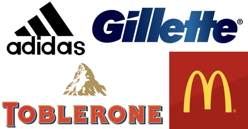
1. Toblerone
![]()
Once you see the bear, you can’t unsee it. But it might take you a while to see it
2. Wikipedia
![]()
It’s an unfinished puzzle, because just like Wikipedia (and Brexit) it will never be complete.
3. Gillette
![]()
The ‘G’ and the ‘i’ are both sliced at an angle to represent just how bleedin’ starp their razors are.
4. BWM
![]()
Look again at the blue and white circle. It’s a propellor whirring away against a clear blue sky!
5. Toyota
![]()
Includes every letter of ‘Toyota’ if you try hard enough
6. Tour de France
![]()
There’s a person on a bike. Top right!
7. Beats
![]()
Headphones logo also wearing headphones
8. McDonald’s
![]()
Apparently the Golden Arches are subliminally supposed to remind people of a pair of breasts. We’re not making this up.
9. Adidas
![]()
Slopes upwards to resemble a mountain, a metaphor for the obstacles people can overcome. Like, how can I afford to buy this new pair of trainers?
10. London Museum
![]()
Each colour outline represents how the capital’s city limits have changed through history.
11. Formula 1
![]()
There’s a ‘1’ hidden between the F and the other thing/go faster stripes!
12. Hyundai
![]()
Represents two people having a handshake, apparently.
13. Domino’s
![]()
A domino, obviously. But the one dot on the right is the first restaurant, opened in 1960, and the two dots on the left are the first franchises opened in 1965. Alternatively, the one on the right is what you get free when you buy the two on the left.
14. NHS Organ Donor card
![]()
You saw the heart bit, but did you notice the two arrows, representing exchange?
15. Pinterest
![]()
The P! It’s like a pin!
16. Amazon
![]()
Not just a smiley face, it also delivers everything from A to Z. But you knew that one.
17. LG
![]()
It’s a winking face. Look closely enough and it is also telling you ‘Shoulda bought a Samsung’
Not a logo but, well, it’s the Beatles, obviously. But did you know this? You probably knew this.
That moment you realize “The Beatles” is a pun. pic.twitter.com/O7PhM4TtzP
— Jesse McLaren (@McJesse) March 1, 2017
READ MORE
That’s enough real logos, here are a bunch of honest ones
H/T Indy100