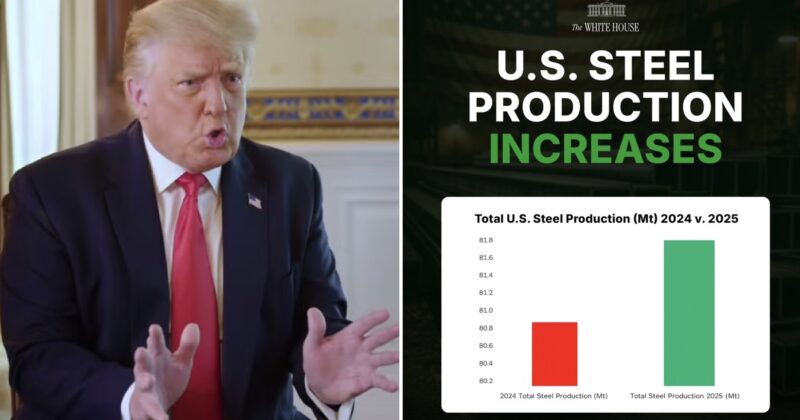
The White House shared this wildly misleading graphic and it’s proof they think Magas will believe anything (and they will)

The White House really wants everyone to believe that they are doing a good job. If that means they have to offend graphic designers, statisticians, and logic in the process? So be it.
This recent tweet from the official White House Twitter account highlights three specific aspects about the current administration.
1) The White House doesn’t want to admit things aren’t going great.
2) The White House doesn’t want to be honest with the public.
3) The White House thinks its supporters are idiots.
Have a look at this crime against graphs.
American steel is BACK. 🇺🇸 pic.twitter.com/gL3xSFUi6B
— The White House (@WhiteHouse) January 30, 2026
Just in case that’s tricky to see in full …
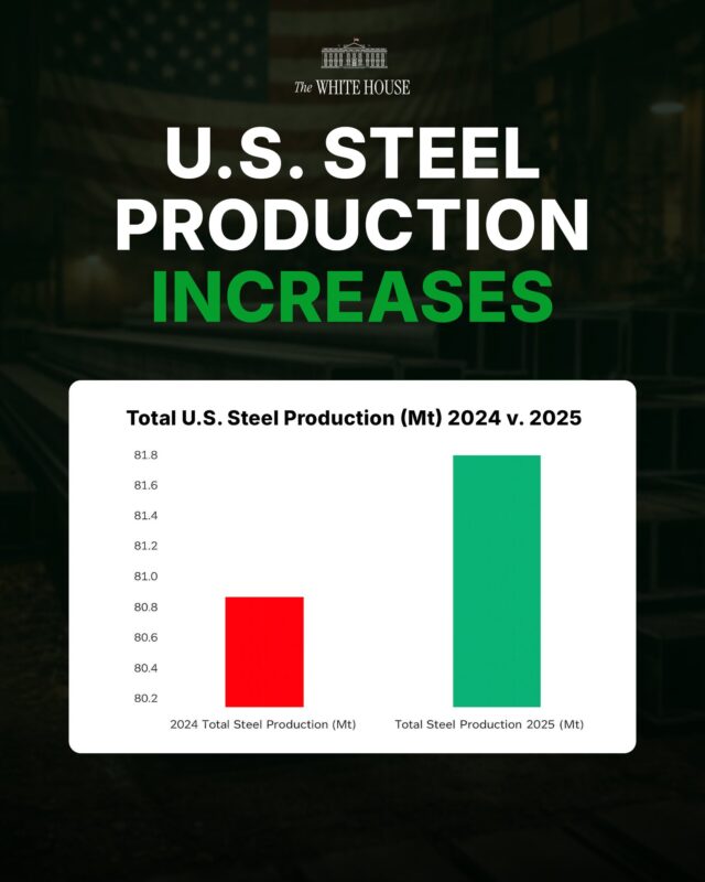
You don’t even need to read individual replies pointing out the absurdity of the Y-axis because the community notes appear right below the graphic to expose the information as fraudulently framed.
It’s ultimately a 1.1% increase in steel production, and yet thanks to the way the graph is designed, it looks like steel production has doubled.
The brazen attempt at propaganda riled up the replies on Twitter.
1.
Your lying graph should actually look like this. But that doesn’t look very impressive. Because it isn’t. pic.twitter.com/kfFgACKYaO
— Nucular (@Nucular314) January 30, 2026
2.
This graph shows a 1% increase in production. And yes, they think you are idiots. https://t.co/8qpirfpkS3
— Oleksiy Sorokin (@mrsorokaa) February 1, 2026
3.
Your chart wasn’t BIG enough, so I fix it pic.twitter.com/lBBvltfJyv
— нетактічний єнот (@enot_reader) February 1, 2026
4.
They think you are dumb https://t.co/tAT6fp4Re3 pic.twitter.com/9U7zDiWX4n
— Spencer Hakimian (@SpencerHakimian) February 2, 2026
5.
DPRK levels of propaganda
— Individual (@restapai) February 1, 2026
6.
That graph is a chart crime
— John Galt (@WhosThisGaltGuy) January 30, 2026
7.
1.11% increase… who did this chart
— Casper (@paravxl) January 30, 2026